Welcome to Kipseli Architects in Athens, Greece! Based on the concept of the beehive (“kipseli” in greek), creative architecture studio Kipseli Architects aims to transform the urban space through a unique structure of cooperation, concentrating on the environment and the human existence within it. Their new office space has been designed with great attention to detail to create an environment that inspires creativity and productivity. As a bespoke house design studio, they wanted their office, their hive, to reflect their passion for architecture and the unique design solutions they offer to their clients. At the center of their new office is a House archetype, which serves as both an everyday meeting space and a separate office booth. This oversized architectural model is waiting to be transformed into a real-life house, and it embodies their commitment to creating spaces that are both functional and beautiful. Surrounding the house is a carefully…
When two sister in-law dentists went to Reena Sotropa In House Design Group studio they were in need of a major overhaul to transform an outdated dental office space they had just purchased. Their clinic, Destination Dental, is not your average dental practice, it is also a wellness spa! Specializing in both dentistry services as well as cosmetics, dermaplaning, massages, and more. This unique concept called for a space that was just as unique and luxurious! When the clients approached the studio, all they had was a branding package consisting of mint and hunter green tones with brass accents. With this in mind, designers brainstormed and developed a space that completely captured a feeling that was aligned with their pre-existing look for their brand’s graphics. Photography : Phil Crozier See also : https://house-diaries.com/escritorio-ubk-escaping-the-standard-office-concept/
The 1930’s warehouse shell has been transformed by Maike Design into a bright and inspiring creative work space. Providing different zones of use throughout offers the flexibility required for both collaborative work and individual creative exploration whilst retaining the original building’s sense of scale. Studio Sisu is designed to address the physical limitations and isolation of an industry fractured by small studio business models. It brings together complimentary businesses to create opportunities for discussion and interaction amongst peers. Encouraging creative collaboration of ideas and skills creates an environment otherwise inaccessible to small businesses or individual practitioners. Using a mixture of high and low cost materials, furniture and fittings has allowed the design to create a highly crafted and unique environment within the specified budget. The inclusion of refurbished antique furniture and fittings allows the new building work to sit comfortably alongside the existing factory structure. Photography : Sean Fennessy See…
The brunch bistro that puts ingredients front-and-center served as an inspiration to dekleva gregoric architects to unveil the space in a similarly candid way: by stripping down the walls and ceiling, we laid out the space’s history from underneath decades of plaster. The naked walls revealed memories from times past, with a mixed construction of brick and stone and brick vaults typical for ground floors in 19th century town structures.The light fixtures are similarly pared back, with nothing but bare bulbs attached to copper wiring, which runs against the ceiling and wall, then disappears in the gap between wooden floor and brick wall. Custom-designed white marble tables reference the traditional French bistro table, their small size and shape allowing for various arrangements of the seating layout, adapting to individuals, couples or private group setups. The thin black structures are also featured on the food showcase wall in the form of…
The family business was looking for a corporate project that would escape the standard office concept – instead, they wanted to feel at home. The integration of spaces with a minimalist, contemporary and sophisticated essence were other key elements, for clients with close ties to art and design. For this corporate project, developed on 250 m², Schuchovski Arquitetura transformed a broad atmosphere – intended for only two partners and five employees – in a truly warm and welcoming space. The use of wood, the choice of powerful works of art and exemplaries of design furniture (such as Vitra armchairs and Tom Dixon lighting) collaborate in creating such an atmosphere. The project is also characterized by a clean and pure concept, in the essence of minimalism, yet extremely refined with the use of marble and metals. Photography : Eduardo Macarios See also : https://house-diaries.com/greenway-views-seniors-living-a-human-centered-design/
Greenway Views, designed by Gray Puksand for LDK Healthcare and Cromwell Property, rewrites the book on design for retirement living and aged care – and it strikes a chord. It presents a new standard of senior living – one in which atmospheric health, ageing in place and genuine quality of life prevail. Located in Canberra, the joint venture between LDK Healthcare and Cromwell Property and delivered by FDC Construction and Fitout breathes new life into five buildings, each with two wings, previously occupied by the Federal Government Department of Social Services. As much an exercise in human-centred design as it is a case for adaptive reuse, Gray Puksand’s design champions a resounding connection between place, community and care, while empowering residents with a deserved sense of freedom and dignity that goes unparalleled in the aged care and retirement living sectors. The central philosophy aims to provide a better quality of…
For Three Tavern’s second location, conceived as equal parts brewery and laboratory, the brand new Imaginarium explores the curious nature of craft brewing. Located in the historic Atlanta Dairies adaptive reuse development a mile from downtown, the volume of the selected space was perfect for the requisite large stainless steel brewing tanks. Square Feet Studio’s biggest challenge was working with the small but very tall footprint and accommodating their client’s desire to have more seating than their first brewery. So they designed a mezzanine that allows the beer-making process to be viewed from different vantage points, each offering its own particular experience. Structure for the upper level was carefully coordinated in and around the brewery’s production area to maximize functionality and safety. Each seating area allows for different vignettes and moods, all with little moments of discovery. To complement Three Tavern’s well-loved interpretation of traditional Belgian-style beers, designers embraced a…
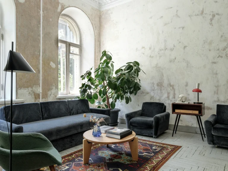
Designed by Kiev-based architect Emil Dervish, ED_OFFICE gives us a glimpse of the firm’s creative world, where the magic happens. The building features incredible architectural detailing including high ceilings with beautiful mouldings, tall arched windows and herringbone flooring. A marriage of modern and traditional, I love how the original details and raw finishes contrast with contemporary furniture and lighting. Photography :Mikhail Loskutov See also :https://house-diaries.com/reitarska-a-studio-full-of-light-in-kiev/
English shop John Lewis is known for its bold and unconventional approach to the design of Christmas interiors, so their festive collections always give tons of inspiration and interesting ideas. This year, the designers put emphasis on moody interiors in complex deep colors, while the decor pieces are colorful and cheerful. Ideas vary from how to create a welcoming Christmas doorway to playful ways to style your fireplace for Christmas. And, of course, there are some glamorous and glossy touches that have already become branded for the company. Enjoy it !!!! See also : https://house-diaries.com/warm-and-serene-christmas-holidays-by-zara-home/
Despite the strange situation we are all in, Christmas is on the way, so it is the perfect chance to cheer up a bit and start decorating…. Zara Home has now released their Christmas collection 2020 and according to them, this holiday season is going to be warm and serene and I think we can all use a bit of that right now. Zara Home: A Portrait of Holidays shows you how you can incorporate their holiday collection in a beautiful serene rustic home. Warm fireplaces, lots of wood and neutral color tones are combined with the red and purple Zara Home Christmas decor. See also :https://house-diaries.com/interiors-with-a-soul-zara-home-autumn-winter-2020-collection/
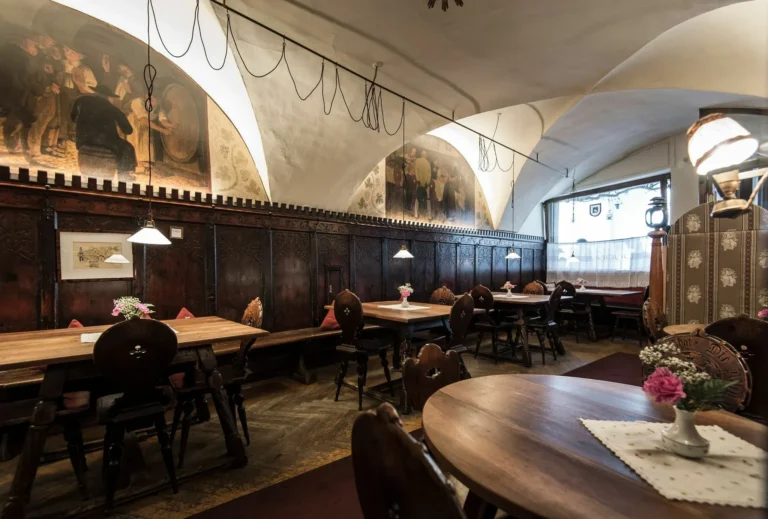
First mentioned in 1277 and owned by the Kamaun family since 1840, the “Red Eagle” (Roter Adler) – now lovingly known to guests and friends as the “Vögele,” or little bird – has been featured in many stories and tales. The site was home to secret meetings during World War II, and the password, “Vögele”, was known to only the most powerful and connected wartime tacticians. Johann Wolfgang von Goethe, a German literary luminary of the 18th and 19th centuries, also appreciated the institution’s very special nature, since even back then the Red Eagle menu featured an outstanding selection of delicacies. Today, the restaurant still hosts the longest-standing regular meeting of patrons anywhere in South Tyrol, with guests gathering to debate and discuss current topics. Artist, host city personality, life artist, original, jack of all trades: This is Karl Kamaun. A young team of architects and designers, noa* (network of…


